

I invite you to take a look at these "About Us" pages dedicated to telling the story, or biography of the people behind the website.
Why You Should Create an Original "About Us" Page
The "About Us" page shouldn't be a formality: it's a very powerful tool to connect, differentiate yourself and build a brand with personality.
- Humanizes your business and creates empathy
- Differentiates you from the competition
- Reinforces your identity and values
- Builds more trust (and conversions)
- Tells your story in a memorable way
- Leaves a lasting impression
If you are also looking for inspiration in design and content structure, we recommend visiting this selection of blog examples created by our team.
About Us Page Examples

Izzy Wheels, colorful images and design
https://www.izzywheels.com/our-story
On the Izzy Wheels website we can find a section called ''Our Story'' where you can learn more about the biography of the creators of this project. One truly exciting and fascinating thing is that they document their history with real photos from their childhood and adolescence.
Additionally, the page is flooded with very vivid and joyful images full of colors. The text is brief and divided into different sections, which is a great strategy to keep users from getting bored or tired.
What is most inspiring about this page?
- Real and emotional images that accompany the story
- Use of a very saturated, vivid and eye-catching mix of colors

Mike Kus, simple but effective design
On the Mike Kus website we can access his story from the header and once we click it, a page deploys covering part of the screen and overlapping the homepage, leaving it visible below. It is very creative and dynamic.
The design and information are very simple. One image and a simple story that is very attractive for its immediacy and fresh design.
What we like about this page
- Appears from the right occupying part of the screen
- Simple and very clean design and information
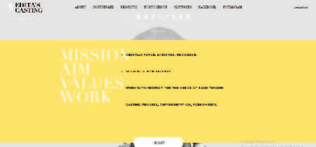
Editos Kastingas, original and brief
https://www.editoskastingas.lt/en/About
When you click the ''about'' button, a horizontal strip appears with all the information about the people behind this website, while still showing the main page in the background, as if we had never left the homepage. This idea is truly very original.
The information is brief, concise, with short phrases describing the project's values and ideas, which makes it a very attractive and easy-to-read message.
Most inspiring aspects of the Editos Kastings story page
- Simple phrases and ideas that summarize this team's work and value
- The About Us page is just a horizontal strip that appears overlaid on the main page

Metalandgas, captivating phrases and modern design
https://metalandgas.com/our-story/
The story of this website spans an entire page full of phrases, biographies and interesting stories about the creators and their project. It is also accompanied by images of cars and trucks that perfectly relate to the overall aesthetics of the website and its concept of strength and modernism.
The small transitions that appear as we scroll vertically are one of the freshest and most attractive details.
Why this page has an attractive design
- Pleasant images and brief, friendly texts
- Interesting stories and captivating phrases
- Impeccable aesthetics in line with the website's design, communicating strength and modernism
Super Fluent Design, one of the most original
http://www.superfluentdesign.com/studio/
These designers knew very well how to stand out and decided to opt for a page that tells who they are in a very original way. It is a vertical mural in which their own images unfold with lots of information about their preferences and professional projects.
The graphics, illustrations and fun and curious facts we can gather about each of them are fascinating.
What we highlight about Super Fluent Design
- Vertical graphic-style design, different and fun
- Fun and curious information about the professionals
- Very pleasant and simple illustrations

Good Story, very simple but sensational
https://goodstory.studio/about/
This page is quite simple; it tells the story of this design team in brief words and we can appreciate many images of their projects and their mission and commitment to clients.
What you will undoubtedly love about its design is the cleanliness and simplicity with which it presents information, making use of white backgrounds and very spacious compositions.
What did we love about this page?
- Its simplicity and minimalism
- Refreshing design and great organization

Visionaire, phrases that capture attention
https://visionaire.cc/about-us/
The very first moment we access this ''About Us'' page we are greeted by a giant phrase in the center of the page that is very captivating and invites you to keep exploring, which is undoubtedly a great way to capture our attention.
As we scroll we can view projects and access much more information about the history of this creative agency.
Most impressive aspects of this About Us page
- Very creative design with incredible full-screen images
- Captivating phrases with giant-sized typography
- Excellent animated details that divert our attention

Monarca Spaces, pleasant design and many images
https://www.monarcaspaces.com/
Just scrolling vertically on this website is enough to find the ''about us'' section. The page is not only minimalist, but it also gives tremendous prominence to images while keeping explanations short and simple.
Although you need to scroll several times to appreciate everything, I assure you the information will be very easy to consume and the visual experience with the images and fresh design is very pleasant.
Why is this one of the pages chosen for this list?
- Very pleasant and refreshing design where images are the center of attention
- The story and information of this team is told in brief words, yet communicating their entire essence at once

211 Studio, dark and contrasting design
In this case we immerse ourselves in a page with a design featuring very dark colors and contrasts with white text and metallic colors. The page telling this designer's story can be found by scrolling vertically.
As we read the text, it produces an interesting effect where it seems to be underlined and guides the reading in an ideal way. We assure you this simple approach will capture your attention without needing anything more in the design.
What we highlight most about the 211 Studio "About Us" page
- Very attractive animated effect on the text
- Design with eye-catching colors and strong contrasts with black and metallic colors
- Brief but very interesting information
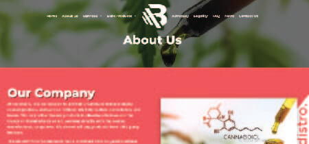
Biodistro, simple and very brief
https://biodistro.com/about-us/
This is one of the simplest examples of ''About Us'' pages. It consists of a text explaining what the team is and what their mission is, with an image accompanying the text.
The design is very organized and undoubtedly pleasant, its simplicity makes it very attractive since this is often what is expected from this type of content within websites, making it an excellent example of conciseness and immediacy if you want to go for a calmer and more direct approach.
What caught our attention on this "About Us" page
- Immediacy and simplicity in the message
- Simple, fresh and organic design
- The header remains when we access this page

Andreaga, a page with lots of information
https://andreaga.com/acerca-de/
On this illustrator's website, her biography page is located within the contacts section, so we must first navigate there to see it. In it, she tells the story of her professional work and mentions important clients for whom she has completed projects.
The design is very clean and spacious and maintains the pastel tones characteristic of her illustrations. It also allows access to a great deal of detailed information about her store, YouTube channel and personal and curious facts about her life.
What we like most about this page
- Its fresh and spacious design, yet colorful and harmonious
- A great deal of detailed information is provided about the illustrator's professional career and personal life

Every where ist, the most fun and creative page
https://www.everywhereist.com/about/
This is one of the most curious pages because of the peculiar way information is presented and its incredible design. The text headings are very fun, for example: ''Someone's Opinion'' or ''These Are the Things I Like''
In them the author of this blog has decided to include valuable and slightly informal information about herself, which gives it an unmistakably fun touch. The page design is also quite peculiar as illustrations imitating hand-drawn sketches are very prominent.
Inspiring details of this "About Us" page
- Very eye-catching design with illustrated details imitating hand-drawn line art
- Fun information and very catchy headings
- Texts with personal and informal data

Tony Dorio, a photographer and a great page
https://www.everywhereist.com/about/
This photographer's biography will captivate you from the very first moment you see the large, imposing title: ''Tony never wanted to be a photographer''. This type of attention-grabbing statement is very effective and makes us want to know everything about the person's life and work.
Additionally, the page features a super attractive design with a very captivating background image with great transparency that allows the text above to be read with total ease. The colors are quite dark and sober and evoke a very professional atmosphere.
Distinctive features of this page
- Very professional, organized and structured design, with serious dark colors
- Attention-grabbing headline with large typography and text that invites reading

Brandon Johnson, spacious and minimalist design
The design of this website is impressive in itself, and the description page could not be the exception. Scrolling through the website we immediately encounter a spectacular design that feels like we are submerged in space.
The subtle animations that allow information to appear gradually is another fascinating thing about this page. Also, it's great how they use minimalism in typography, texts and geometric line details to beautify the design.
The most impressive things you will see on this page
- Great design that imitates a journey through space
- Minimalism present in text design, compositions and graphics and illustrations
- Tasteful animated effects

The beast is back, minimalism and beauty
https://www.thebeastisback.com/about
The beast is back has a fairly simple but visually very pleasant ''about'' page. The header remains visible on this page and one of the most striking features is its minimalism and use of white backgrounds with plenty of space.
It is also worth noting that in this section the designer chooses to mention in a few words and with a very pleasant language, very charismatic personal details as well as professional information about his clients and projects.
Why this "About Us" page design is so pleasant
- Excellent use of space and airy compositions
- Minimalist and refreshing design
- Pleasant language and concise, very useful information

Toy fight, original name and design
https://www.everywhereist.com/about/
This page is not only creative aesthetically, but also the name is very original: 'Who''. The incredible designs include everything from very peculiar 3D models accompanying the information, to great animations as we scroll.
The language and small touches of humor will surely bring a smile to your face.
The most amazing things about this page
- Super peculiar design with some 3D character models
- Fun language and design that is very out of the ordinary
When developing or updating an "About Us" page, it is essential to consider accessibility to ensure that all users, regardless of their abilities, can navigate and understand the content. Implementing accessibility practices in WordPress not only improves user experience, but also reflects the company's commitment to digital inclusion.


Comments
Be the first to comment on this post.