

Take a look at these highly original websites for inspiration. Because I assume you already know this: to stand out you must not look the same as everyone else — though it may seem like hyper-obvious logic when you see it, in reality most businesses don't dare to break away from what their competitors are doing.
Why it is important to have an original website
Creating an original website is not a whim, it is a business strategy. A unique website:
- Sets you apart in a saturated market.
- Captures attention immediately and creates a visual impact.
- Improves user experience and keeps them on the site longer.
- Boosts SEO rankings and increases your traffic.
- Increases conversions and sales.
- Reinforces your brand and business identity.
If you are looking for inspiration for your website, it is useful to see both good and bad examples. While we show original and creative designs here, you can also learn a lot from a selection of poorly designed web pages to avoid common mistakes.
Examples of truly original websites
The website for the book «The search for work happiness»

https://www.findworkhappiness.com/
This website tries to promote a book about maintaining mental health and achieving happiness at work. Visiting this site is amazing. It reminds me of "Where's Waldo?" books, but as a website. A very dynamic, attractive, and entertaining site, without a doubt.
Why I placed this website first on the list of original websites
- It is a very dynamic website where the user must interact to navigate through it
- The bubble-with-colour hover effect on the chapters is outstanding
- You can explore the main illustration for a long time, discovering new details
- While exploring the illustration, you lose your sense of X and Y coordinates
A design that interacts with its visitors

https://otr-south.org.uk/
A dynamic design that can move with the visitor is, without doubt, a trend that OTR South manages very well. The creators knew how to lighten a topic as serious as mental health. Designed for a young audience, they used vivid and bright colours that harmonise well, successfully capturing attention — all without losing the goal of conveying the message of offering help to those who need it.
What makes OTR South so original and eye-catching
- Conveys complex topics with youthfulness and energy
- Youth-oriented typography
- Uses animations that the visitor can interact with
- Vivid colours on a cool-toned background

Vana, one of the most original web designs
https://www.vana.com/
This website uses an almost 80s-inspired design aesthetic. With very bold colours implemented in an incredibly effective way. It features some elements with a Parallax effect, giving it a very dynamic feel.
What makes the Wild Fox Squad page original
- Masterful use of colour
- Simple animations
- Parallax effect

Myla Yeomans: A revelation of text and colour on a large moving scroll
Animations are not only for youthful characters — a way to use them in a more mature aesthetic is as Myla Yeomans has done. This website, designed as a resume website, prioritises colour and messaging. The movement is created to capture attention through colour changes and then focus on the content.
What makes Myla Yeomans's website so original and attractive
- Intense colours transitioning to neutral tones
- Interactive mouse cursor that presents images accompanying the text
- Easy scroll-style visualisation in the form of a scroll
- Large texts as the stars of the design

Match Artists: Using photography as the primary communicator in design
https://matchartists.co/
Unlike the previous example, at Match Artists text takes a back seat. Instead, photography takes centre stage. This design is ideal when the site focuses on art or fashion.
As the visitor scrolls through the site, the animation highlights each photograph, drawing attention to it inevitably through a zoom-in and zoom-out dynamic.
What elements stand out on the original Match Artists website
- The image as the star
- The animation that brings us closer to the image as we scroll
- The various directions accessible with a subtle mouse movement
- The animated frame visible on each photograph

Thursday: An asymmetric geometry for a highly original website
https://www.getthursday.com/
Lines as frames for text, images, and colours form a very eye-catching geometric design style. In the case of Thursday, a dating app, rectangles of different sizes are used to frame paragraphs and images, creating an asymmetry that prevents the site's aesthetic from feeling monotonous.
With a variety of bright colours on a pale pink background, letters of different sizes in various styles, and animations, an effect is created that contrasts with the rigidity of the section frames.
What makes Thursday so original and noteworthy
- The calendar-style design of the page
- The contrast between the rigidity of geometry and asymmetric elements
- The use of eye-catching colours in a light manner on a pale pink background
- The typography that simulates handwriting

Skin Clinics: Warm tones to create a more welcoming site
https://skinclinics.ca/
Generating sensations through the elements that make up a web design is an important aspect that allows certain ideas to be conveyed. The designers of Skin Clinics understood that a warm palette evokes a sense of home that distances the clinic from the classic notion of a cold, sterile medical space.
Pale pink accompanies the clinic's walls and the entire digital design. The colour palette plays with soft, neutral tones. This aesthetic integrates with a geometric style that provides both the structure and the seriousness befitting a medical space.
Why the Skin Clinics design is original and effective
- Uses a colour palette suited to the idea they want to convey
- Employs a design that differentiates from the classic clinic appearance without losing the seriousness it requires
- Uses subtle animations to maintain a sober style

Chia Studio: Circular elements to highlight communication in design
https://www.chiastudios.com/
Integrating circular elements into web design is not always straightforward. At Chia Studio they dared to make this shape their primary element. They achieve it by using plenty of white space and short texts to avoid a cluttered feel.
The circle helps to highlight, in a very effective way, both images and text. The latter become focal points when visiting this website. Moreover, this design integrates well with other geometric shapes such as squares and rectangles, provided they are not overused. A website that can serve as a reference for your inspiration.
What makes Chia Studio an original and tasteful website
- Circular icons to highlight what they want to communicate in an uncluttered space
- Texts organised in a circular pattern with movement that invites reading
- Cool-toned background that contrasts with more vivid and intense design elements
Pixel Bakery: Opposite colours for a visual impact in web design
https://pixelbakery.com/
The colour palette typically used in web design generally includes two to four colours, which can be complementary — to create a harmonious space — or completely opposite, to make an impact through contrast.
At Pixel Bakery they opted for opposite colours, using blue and red, which helped the images stand out and gave the design a great deal of energy and dynamism even in sections without animation.
What elements make an impact on the Pixel Bakery page
- Opposite colours well integrated with neutral tones
- The use of pink as an intermediate colour
- The alternation of short texts with videos and animations
- The use of perspective to give the logo a three-dimensional quality

JB10X: An innovation that returns to the classic
A retro design can also be an original one. Proof of this is the design of JB10X, a consultancy company that adopted the classic programming style. With vibrant colours and a typography reminiscent of HTML, this website bets on making the classic feel new again.
What makes JB10X stand out as an original website
- Its style that visually simulates programming
- Bold, very eye-catching colours
- HTML-style typography
- Its simple design that gives prominence to text without being boring

Kiran CK Crafts: Minimalism as a design style that remains on trend
https://kiranckcrafts.com/
Minimalism is a trend within the broad world of design for the sense of cleanliness, spaciousness it conveys, and because it is a style that communicates easily with essential resources. The Kiran CK Crafts website focuses on text and image, using a harmonious animated transition to give emphasis to one over the other at different moments.
What makes the minimalism of Kiran CK Crafts so original
- A scroll animation that alternately gives priority to text and image
- Neutral colours that subtly play with the occasional intense tone
- The use of negative space that harmonises with the background of each photograph
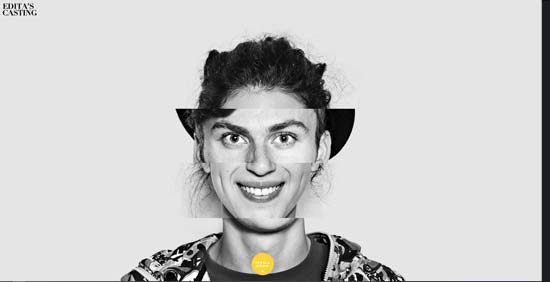
Edita's Kastingas: a collage design selection that is timeless and inspiring
http://www.editoskastingas.lt/
Collages are a visual resource that has been adapted across many areas of design. Edita's Kastingas has implemented it masterfully. Being a casting and acting agency, they have chosen to present different facial features from different people blended together to create a new face.
Why Edita's Kastingas is so interesting and original
- Thanks to the collage as a fun and fresh design resource
- For its neutral, grey, and black colour palette that is not afraid to incorporate an intense tone
- For its animation that gives colour to the image

Izzy Wheels: A colour style that invites movement
https://www.izzywheels.com/
Colour can give movement to something static — at least, that is the visual sensation we get. At Izzy Wheels, a website offering wheelchairs with spectacular designs, the product they promote is leveraged very well because they combine its vibrant colours with the page's tones. This creates a feeling of mobility and dynamism.
What is spot-on and original about Izzy Wheels
- They know how to incorporate a variety of colours
- The geometric style of the page has great freshness thanks to colour
- Vibrant and cheerful colours help to convey a positive message to people with disabilities

Robby Leonardi: Incorporating the playful as the basis for an original website
http://www.rleonardi.com/
Gamification is a learning technique through games, and it is a widely used tool in communication. It can also be incorporated into web design. In the case of Robby Leonardi, it has been implemented to present his portfolio and CV in an interactive way.
What makes the interactive version of Robby Leonardi's page so original
- The use of gamification for a work portfolio and CV
- The interactive aspect as a resource for a more personal presentation
- Incorporating the playful to communicate

Understanding Neurodiversity by Project Lima: a sensory experience as innovative web design
https://projectlima.co/neurodiversity/
Today, designs include more elaborate techniques to create a unique site — one of them is the ability for people to interact with the website. Undoubtedly a website that stimulates inspiration. But Understanding Neurodiversity takes it much further, creating an immersive digital narrative so that the visitor can be part of it.
What makes Understanding Neurodiversity a sensory and original design
- The use of audiovisual elements
- Implements a digital narrative with immersive techniques
- The interactive mode that advances the story
- Elaborate animations that keep visitors engaged

Cyber Tribe: Video game design, a fully interactive experience
https://cybertribe.gg/
Another example worthy of admiration among NFT sites is the design work of Cyber Tribe, a page that creates a fully interactive virtual reality space. The visitor can take a tour as if it were a video game. This is, without doubt, a whole experience for those who visit this website. You should just bear in mind that the initial loading time can be a little slow, depending on the device used.
What makes Cyber Tribe so original
- The virtual reality or video game design
- The interactive possibilities available to the visitor
- Its futuristic aesthetic

Mutant Stand, a visual impact among original websites
Mutant Stand is a Web 3.0 community in Japan. Although it is not a video game, it features many graphic characteristics that make us feel like we are moving through one.
Why Mutant Stand is so original
- Green tones throughout the entire website
- Constant animations
- Retro effect in some sections
- Exquisitely designed elements


Comments
Be the first to comment on this post.